As a BI engineer, data visualization is an essential aspect of your work. It allows you to communicate complex information in a clear and concise manner, helping you and your team make better decisions. In this article, we’ll explore some of the most important data visualization techniques and tools for a Business Intelligence Engineer.

The Role of a Business Intelligence Engineer
Before we dive deeper into data visualization techniques, it’s important to understand the role of a business intelligence engineer. BI engineers are responsible for designing and implementing business intelligence solutions that help organizations make data-driven decisions. They work with data analysts, data scientists, and other stakeholders to understand business requirements, design data models, and develop data visualizations. In this section, we’ll explore the skills and qualifications required for a career as a BI engineer and discuss the typical job description for this role.
How is Data Visualization Used in Business Intelligence?
Data visualization is a crucial component of business intelligence, as it allows BI engineers to present complex data in a way that is easy to understand and analyze. Instead of poring over rows and columns of numbers, data visualization enables users to explore and interact with data in a visual and intuitive way.
Data visualization is used in a wide range of business intelligence applications, from analyzing sales data to tracking website traffic to monitoring customer behavior. In each case, the goal is to identify patterns and trends in the data, which can help businesses make informed decisions and gain a competitive advantage.
The Benefits?
One key benefit of data visualization is that it allows users to see relationships and connections between different data points that may not be immediately obvious from looking at the raw data. For example, a line chart might reveal a trend in sales over time, while a scatter plot might show a correlation between two different variables. By presenting data visually, BI engineers can quickly identify insights that might be missed in a table or spreadsheet.
Another important aspect of data visualization is that it allows users to interact with data and create customized reports. By using tools like Power BI or Tableau, BI engineers can create dashboards and reports that are tailored to the needs of specific users or teams. For example, a sales team might need a dashboard that tracks sales by region, while a marketing team might want to see a dashboard that tracks website traffic and engagement.
In addition, data visualization plays a key role in data storytelling, which is the practice of using data to communicate a narrative or message. By creating compelling data visualizations, BI engineers can convey complex information in a way that is both engaging and informative. This can help businesses make better decisions and gain a deeper understanding of their customers and operations.
What Are the Four Data Visualization Techniques?
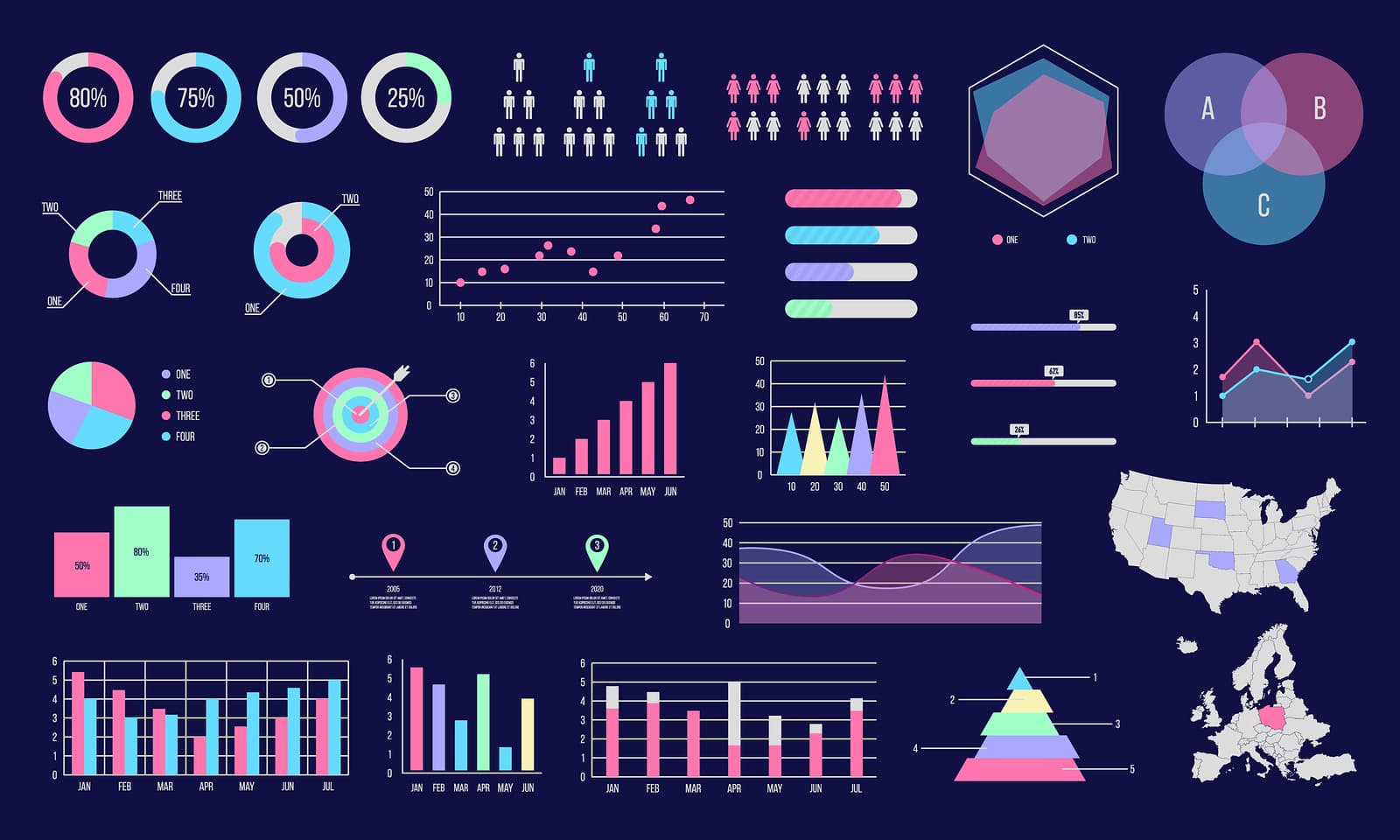
Data visualization is a crucial tool for business intelligence, and there are four primary data visualization techniques that BI engineers use to present data in different ways. These techniques include charts, graphs, maps, and tables, each with their own strengths and weaknesses.
Charts
Charts are commonly used to display numerical data, and there are many types of charts, including line charts, bar charts, and pie charts. Line charts are useful for visualizing trends over time, bar charts are useful for comparing data across different categories, and pie charts are used to display proportions or percentages. To create interactive charts, BI engineers may use powerful software tools such as Power BI or Tableau that can be customized and shared with ease.
Graphs
Graphs are similar to charts, but they’re often used to display more complex data sets. For example, a scatter plot might show the relationship between two different variables, and a bubble chart might show three different variables at once. Graphs are useful for visualizing patterns and correlations in data, allowing BI engineers to identify insights that might not be immediately apparent from the raw data.
Maps
Maps are a powerful data visualization technique used to display geographic data. BI engineers can use mapping tools like Power BI Connect to Azure Synapse or Elasticsearch to create maps that display data points by location. For instance, a map could show the locations of customers or stores, or it could display data on population density or traffic patterns. Maps can be particularly useful for businesses that operate across multiple regions or countries.
Tables
Tables are a simple and effective way to display data in a tabular format. BI engineers may use tables to compare data across different categories, or to display data that is difficult to visualize in other formats. For example, tables might be used to display data on employee performance or customer feedback. Tables are also useful for creating reports or summaries of large data sets.
By using these four primary data visualization techniques, BI engineers can create compelling and informative visualizations that help businesses make data-driven decisions. Depending on the specific needs of the business and the data being analyzed, different visualization techniques may be more appropriate than others. However, by understanding the strengths and weaknesses of each technique, BI engineers can create powerful visualizations that provide valuable insights.
What Are the 5 Steps in Data Visualization for a BI Engineer?
As a BI engineer, you need to have a clear understanding of how to turn complex data into meaningful insights. One effective way to achieve this is by following a structured process for data visualization. Here are the five essential steps to create impactful visualizations that will help you make data-driven decisions:
Step 1: Determine Your Goal
Before you start creating visualizations, you need to determine your goal. Ask yourself what questions you want to answer or what insights you want to gain from the data. This will help you focus on what data is relevant and what type of visualization is appropriate.
For example, if your goal is to identify trends in sales data, you might want to create a line chart that shows sales over time. If your goal is to compare data across different regions, a map might be more appropriate.
Step 2: Identify Your Audience
Identifying your audience is critical in data visualization. Consider the knowledge and experience of the people who will be using your visualizations. You should use language and visual elements that are easily understandable by the intended audience.
For example, if your audience consists of people from non-technical backgrounds, you may need to simplify the visualizations to make them more accessible.
Step 3: Gather Your Data
Once you have a clear goal and audience in mind, it’s time to gather your data. Collect and organize the data you need to answer your questions and support your goals. Make sure your data is clean, accurate, and up-to-date.
Step 4: Choose Your Visualizations
Selecting the right visualizations is crucial in data visualization. You need to choose visualizations that clearly communicate your findings and support your goals. Select the type of visualization that best suits your data.
For example, if you want to show the relationship between two variables, a scatter plot might be appropriate. If you want to compare data across different categories, a bar chart might be more suitable.
Step 5: Present Your Findings
Finally, present your findings in a way that is easily understandable to your audience. Use your chosen visualizations to communicate your insights clearly and concisely. Highlight the key takeaways from your data and provide recommendations based on your findings.
By following these five steps, you can turn complex data into actionable insights that will help you make data-driven decisions. Remember that data visualization is an iterative process, and you may need to adjust your approach based on feedback and further analysis. But by following a structured process, you can ensure that your visualizations are effective and impactful.
What Are the 3 Main Goals of Data Visualization?
Data visualization is an essential tool for business intelligence, and its three primary goals are to simplify complex data, highlight patterns and trends, and provide insights for decision-making. In this section, we’ll explore each of these goals in detail.
Simplify Complex Data
One of the primary objectives of data visualization is to simplify complex data. When dealing with large and complex data sets, it can be challenging to understand the underlying patterns and relationships. Data visualization helps to simplify the data and make it more accessible to a broader audience. Visual representations of data, such as charts, graphs, and tables, are much easier to understand than raw data sets.
Highlight Patterns and Trends
Another crucial goal of data visualization is to highlight patterns and trends. Visualizations help to bring attention to significant patterns and trends that may not be immediately apparent in the raw data. They enable users to quickly identify trends, outliers, and other critical features of the data that might be missed by a simple inspection of the raw data.
Provide Insights for Decision-Making
The ultimate goal of data visualization is to provide insights for decision-making. By presenting data visually, businesses can better understand the data and make more informed decisions. Effective data visualization helps users to identify opportunities, make predictions, and uncover new insights. Visualizations allow for data to be explored interactively and provide an excellent way to communicate results to stakeholders.
In summary, data visualization has three primary goals: simplifying complex data, highlighting patterns and trends, and providing insights for decision-making. By achieving these goals, businesses can better understand their data and make informed decisions that drive growth and success.
Top Data Visualization Tools for a Business Intelligence Engineer
Data visualization is a crucial aspect of business intelligence, and selecting the right tool for the job is essential for achieving the desired results. Here are some of the top data visualization tools that are commonly used by business intelligence engineers.
1. Tableau

Tableau is one of the most widely used data visualization tools for business intelligence. It is known for its ease of use and ability to handle large data sets. Tableau is highly customizable and allows users to create interactive dashboards and reports. It supports a wide range of data sources, including spreadsheets, databases, and cloud services. The downside is that it can be expensive, especially for small businesses.
2. Microsoft Power BI

Power BI is another popular data visualization tool that is widely used in business intelligence. It is known for its ease of use and flexibility, allowing users to create customizable dashboards and reports. Power BI integrates seamlessly with other Microsoft tools, such as Excel, and supports a wide range of data sources. The downside is that some advanced features may require additional licensing.
3. QlikView
QlikView is a powerful data visualization tool that allows users to explore and analyze data in real-time. It is highly customizable and supports a wide range of data sources, including big data. QlikView is known for its ability to handle complex data and provide powerful insights. The downside is that it can be expensive and has a steeper learning curve compared to some other tools.
4. Domo
Domo is a cloud-based data visualization tool that allows users to create interactive dashboards and reports. It supports a wide range of data sources, including spreadsheets, databases, and cloud services. Domo is highly customizable and has a user-friendly interface. The downside is that it can be expensive, and some advanced features may require additional licensing.
5. Google Data Studio
Google Data Studio is a free data visualization tool that is great for small businesses and individuals. It allows users to create customizable reports and dashboards using data from Google Sheets and other data sources. Google Data Studio is easy to use and integrates seamlessly with other Google tools, such as Google Analytics. The downside is that it may not be as powerful or customizable as some of the other tools on this list.
There are a lot more business intelligence tools and data vizualization tools that you can explore, we suggest checking out this post from GURU99 for the 25 BEST Data Visualization Tools.
Essential Skills for Business Intelligence Engineers
As a business intelligence engineer, it is essential to possess a combination of technical and analytical skills to excel in your role. Here are some of the essential skills you should have and some tips for developing them.
Technical Skills
Proficiency in Programming Languages
BI engineers should have a strong foundation in programming languages such as SQL and Python. SQL is used to extract data from databases, while Python is used for data analysis and data visualization. Other programming languages that are commonly used in BI include R, Java, and C++.
Data Modeling and ETL Processes
Data modeling is the process of designing a database that is efficient, scalable, and optimized for the specific needs of an organization. BI engineers should be skilled in designing and implementing data models that can handle large amounts of data while ensuring data quality and consistency.
Extract, Transform, Load (ETL) processes are used to extract data from multiple sources, transform it into a consistent format, and load it into a target database. BI engineers should be experienced in designing and implementing ETL processes using tools like Apache NiFi, Talend, or SSIS.
Data Visualization Techniques
As mentioned earlier, data visualization is a crucial aspect of business intelligence. BI engineers should have a strong understanding of the different data visualization techniques, including charts, graphs, maps, and tables. Additionally, they should be proficient in using data visualization tools such as Tableau, Power BI, or QlikView.
Analytical Skills
Analyzing Data
BI engineers should have a strong foundation in data analysis. They should be skilled in analyzing large and complex data sets to identify trends, patterns, and insights that can inform decision-making.
Communication Skills
Effective communication skills are critical for BI engineers. They should be able to communicate complex data and analysis in a clear and concise manner to both technical and non-technical stakeholders.
Tips for Developing Your Skills
To develop the essential skills required for a BI engineer, consider the following tips:
- Take courses or certifications in programming languages like SQL and Python to enhance your technical skills.
- Participate in training programs to learn data modeling and ETL processes.
- Practice designing and implementing data models and ETL processes on personal projects or open-source data sets.
- Build a portfolio of data visualization projects using tools like Tableau, Power BI, or QlikView.
- Participate in hackathons or data analysis competitions to sharpen your analytical skills.
- Attend industry conferences and meetups to network with other BI professionals and stay up to date on emerging trends and technologies.
Best Practices for Data Visualization in Business Intelligence Engineering
Data visualization is a crucial component of business intelligence, and it’s important to use best practices to create effective visualizations. By using the right type of visualization, designing effective dashboards, and avoiding common mistakes, BI engineers and data professionals can create visualizations that effectively communicate insights and facilitate data-driven decision-making.
Select the Right Type of Visualization
Choosing the right type of visualization is essential to ensure that the data is displayed in a way that is easy to understand and interpret. BI engineers should have a thorough understanding of the available visualization types, such as charts, graphs, tables, and maps, and when to use each one. They should also be familiar with specialized visualization types, such as heat maps, sparklines, and treemaps, and be able to identify which type of visualization is best suited for a particular data set.
Design Effective Dashboards
Dashboards are an essential tool for BI engineers to present data in a way that is easy to understand and navigate. Effective dashboards should be designed with the end-users in mind and should display the most important information in a clear and concise manner. BI engineers should consider the audience’s needs and tailor the dashboard to their specific requirements. Dashboards should also be interactive, allowing users to drill down into the data and explore the information in more detail.
Avoid Common Mistakes
There are several common mistakes that BI engineers should avoid when creating visualizations. One common mistake is overcomplicating the visualization, making it difficult for the audience to understand. Another mistake is using misleading or inaccurate visualizations, which can lead to incorrect conclusions and decisions. BI engineers should also avoid cluttering the visualization with unnecessary information or using too many colors or shapes, which can be confusing and distracting.
Utilize Business Intelligence Tools
Using specialized BI tools can help BI engineers and data professionals to create effective visualizations. There are many BI tools available, such as Power BI, Tableau, and QlikView, which can help to automate data visualization processes and make it easier to create effective visualizations. These tools can also help to improve data accuracy and reduce the risk of errors.
Data Engineer vs BI Engineer: What’s the Difference?
While both Data Engineers and BI Engineers work with data, their responsibilities and skill sets are quite different. The key differences between the two roles include:
- Focus: Data Engineers focus on the back end of the data pipeline, while BI Engineers focus on the front end.
- Skills: Data Engineers must be proficient in programming languages like Python and Java, while BI Engineers must be proficient in data visualization tools like Power BI and Tableau. We have a great breakdown of the Best Data Engineering Tools if you’re interested go and check it out!
- Responsibilities: Data Engineers are responsible for building and maintaining data infrastructure, while BI Engineers are responsible for creating and maintaining data visualizations.
- Salaries: According to Glassdoor, the average salary for a Data Engineer in the United States is $114,000 per year, while the average salary for a BI Engineer is $118,000 per year… very similar!
Conclusion
In conclusion, data visualization is an essential part of business intelligence engineering. By using powerful visualization techniques and tools, BI engineers can analyze and present complex information in a way that is easy to understand and act upon. As you explore different visualization tools and techniques, keep in mind the importance of determining your goals, identifying your audience, and choosing the right visualizations for your data.
Ben is a full-time data leadership professional and a part-time blogger.
When he’s not writing articles for Data Driven Daily, Ben is a Head of Data Strategy at a large financial institution.
He has over 14 years’ experience in Banking and Financial Services, during which he has led large data engineering and business intelligence teams, managed cloud migration programs, and spearheaded regulatory change initiatives.